

Sandown Vet Clinic
User Experience, User Interface and brand Design
How might we build a customer-centric website that is informative, practical and allows users to feel connected to the values and personality of the clinic?
I was aproached by the owners of Sandown Vet Clinic for what was originally scoped as “a simple website redesign” - tidy up the layout, clean up the styling, job done. However after some initial consultation, I realised that there were many more problems here to solve beyond just restyling the website.
Through research and discovery, I learned that many of the basic needs of customers were not being catrered for on the website, leading in an increase of call traffic to receptionists, which resulted in staff being overwhelmed and frustrated… not to mention the poor customer experience.
Starting with a full brand restyle, I worked closely with the owners and managers of the clinic to build an identity, website and booking process that would improve the relationship between customers and the clinic.
whats the problem?
Sandown Vet Clinic is a fast paced clinic with so much experience, personality and specialised services, but their online platforms failed to recognise what their customers actually needed from them, and their brand identity failed to communicate who they really are, and what makes them special. This resulted sub-par booking and enquiry processes, and a disconnection between the values of the clinic, and how customers percieve them.
Before
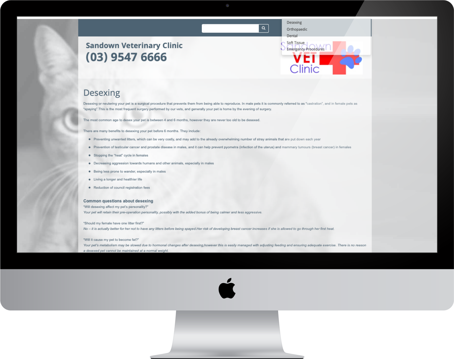
The original website was bland, difficult to navigate, and failed to answer any of the common questions that customers wanted to know when visiting the website.
After
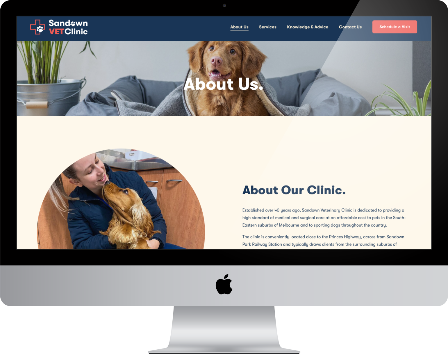
The new website is friendly, welcoming and informative. It caters for the needs of different types of website visitors, proactively answering their questions, and simplifying their booking process.
About the clinic
Sandown Vet Clinic is a busy, family-owned veterinary practice that not only have a reputation for giving gold standard veterinary care to people and their pets but also providing trusted specialist knowledge and care in the area of canine sports medicine and reproductive technologies.
Although the work can be emotionally draining, they don’t take themselves too seriously and their success as a team is centred on their staff genuinely caring about the work that they do. They have so much personality, yet the current brand has none... Apart from the logo, and use of red, there’s really nothing tying the brand together, and communicating who they are to their customers.


Research
Types of customers
With the help of the clinic receptionists and staff, we talked to customers that visited the clinic to learn about the different reasons for visiting the website and the clinic. We determined that there are 9 basic types of customers who interact with the clinic, which we placed on an engagement spectrum.

Customer needs
After talking to diferent types of customers, we were able to learn more about what they look for in a vet clinic, the reasons they would want to (and need to) use the website, and any additional ways that we could help improve their relationship and interactions with the clinic.
Customer need #1
To make a booking / inquiry
- Call the clinic via phone
- Online booking
- Manage apointment
- Find contact details
- Clinic address / directions
Customer need #2
To learn about services
- Quickly skim primary services
- Browse all available services
- Search / find a specific service
- Learn more about specialised services
Customer need #3
To be informed
- Learn about the clinic
- Learn about pet health and preventative care
- Access additional resources
- Ask a question / browse FAQ’s
Customer need #4
To build trust
- Build trust by guaging profesionalism
- Build connection to brand personality
- Compare to other clinics
- Connect to online social media platforms
- Meet the team
Website strategy & design
Information Architecture
Current Sitemap:
The next step was to redesign the information architecture of the website to ensure that the needs of users were being catered for. I started by illustrating the current sitemap, which allowed me to visualise how the content structure resulted in poor navigation experiences that didn’t align with user needs
Revised Sitemap:
I develop a content strategy and sitemap that would encourage progressive exploration of website content - meaning that the most common & general info would be readily available from the homepage, a wider range of info (mainly services) would be just one click away, and for the users that require additional information and resources, they could click through to the third layer of content. This ensured that the enormous amount of service information was accessible, whilst avoiding an overwhelming experience for users more interested in a casual browse.
I created a sitemap and website layout with labels to indicate how we are solving each of the primary user needs. The information architecture allows for easy access to a range of booking and enquiry methods, clear information about the clinic, services and general pet advice, and some personal touches to help build a better relationship between clinic and clients.
Brand and identity design
Brainstorm
I worked closely with the staff at the clinic to brainstorm and mood board the personality of the clinic. We landed on something that was fun (but not too goofy), happy, organic/natural, clean/modern, and used softer pastel colours. Photography would be a big part of showing the world what goes on behind closed doors, so we created a moldboard that consisted of soft, natural tones in the primary brand colours, and photos of happy, sweet and cute animals and photos of staff/owners loving and caring for their pets.
Brand design
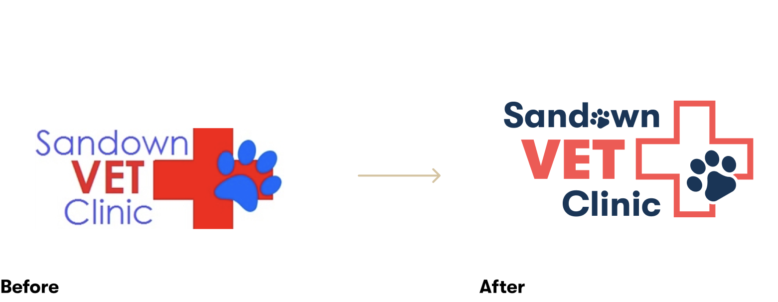
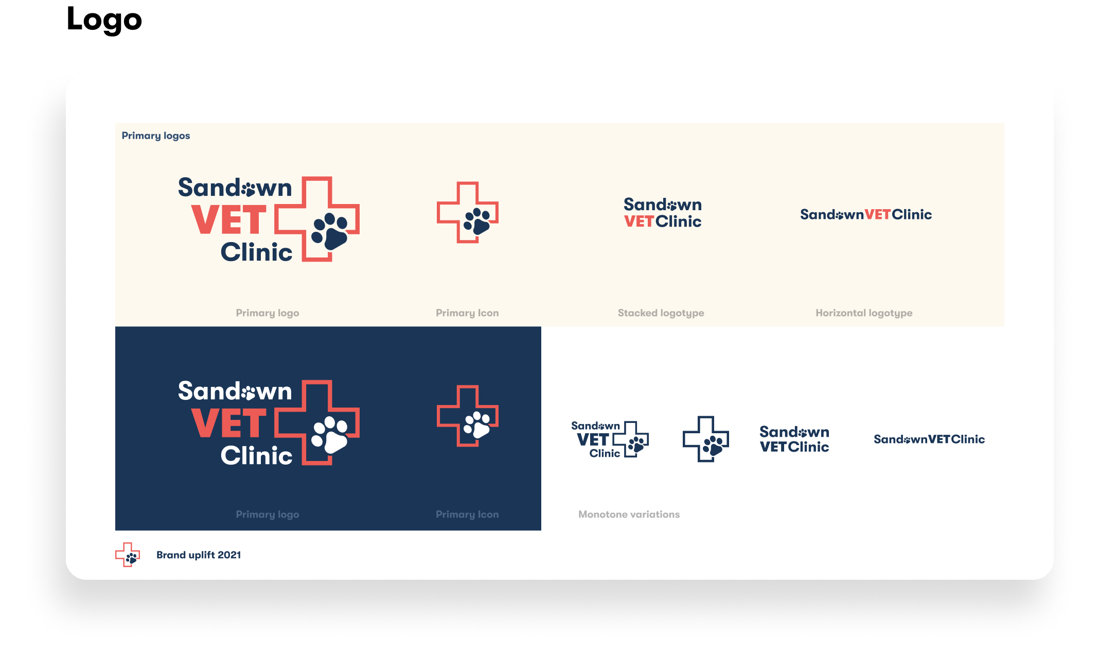
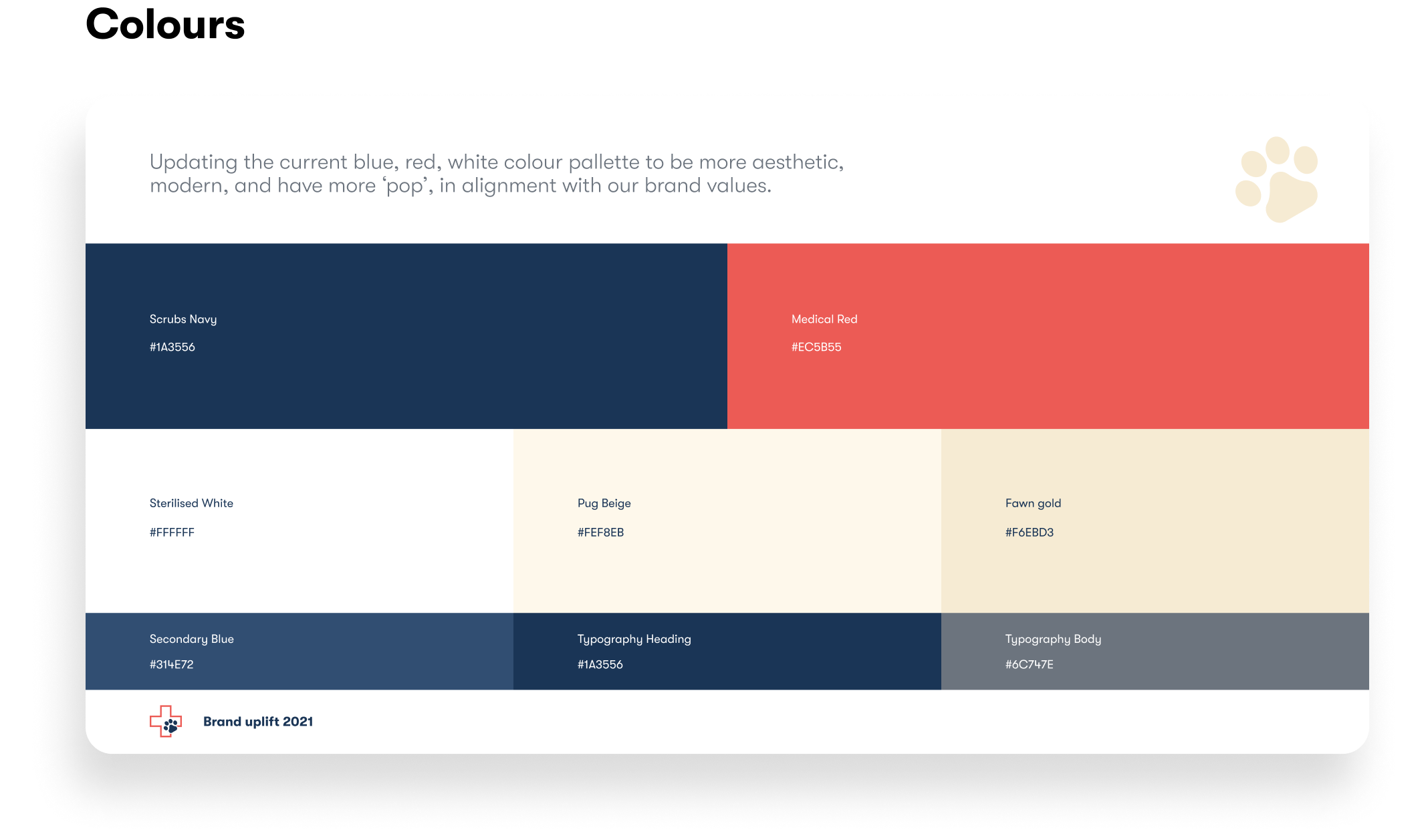
The new logo is an uplift on the existing logo, with updated typography and graphic styling to better reflect the friendly personality of the clinic. The red cross is now outlined to balance the design, frame the ‘paw’, and reduce the feeling of dramatic urgency from the previous design. The new design increases legibility, scalability and balance.
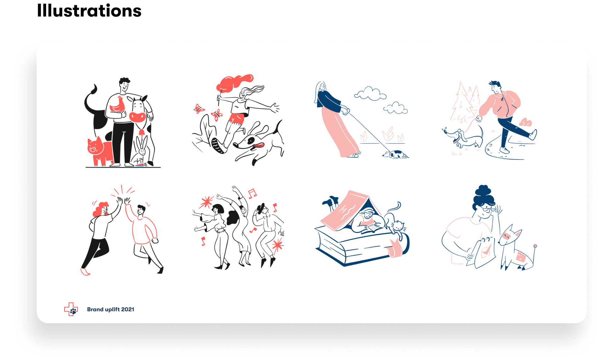
Introducing new brand elements allowed us to create a more dynamic graphic style, to be used across print, digital and signage. Using the paw from the logo, and the pad from the paw helps tie the brand together.

Style guide & pattern library
A style guide and a component library was created in order to ensure consistent styling across all applications of the brand, and to save time when constructing the high fidelity website prototype. Much like the logo, it was important to respect the legacy of the previous branding, while also giving it a modern uplift and a boost of personality that would reflect the brand values.


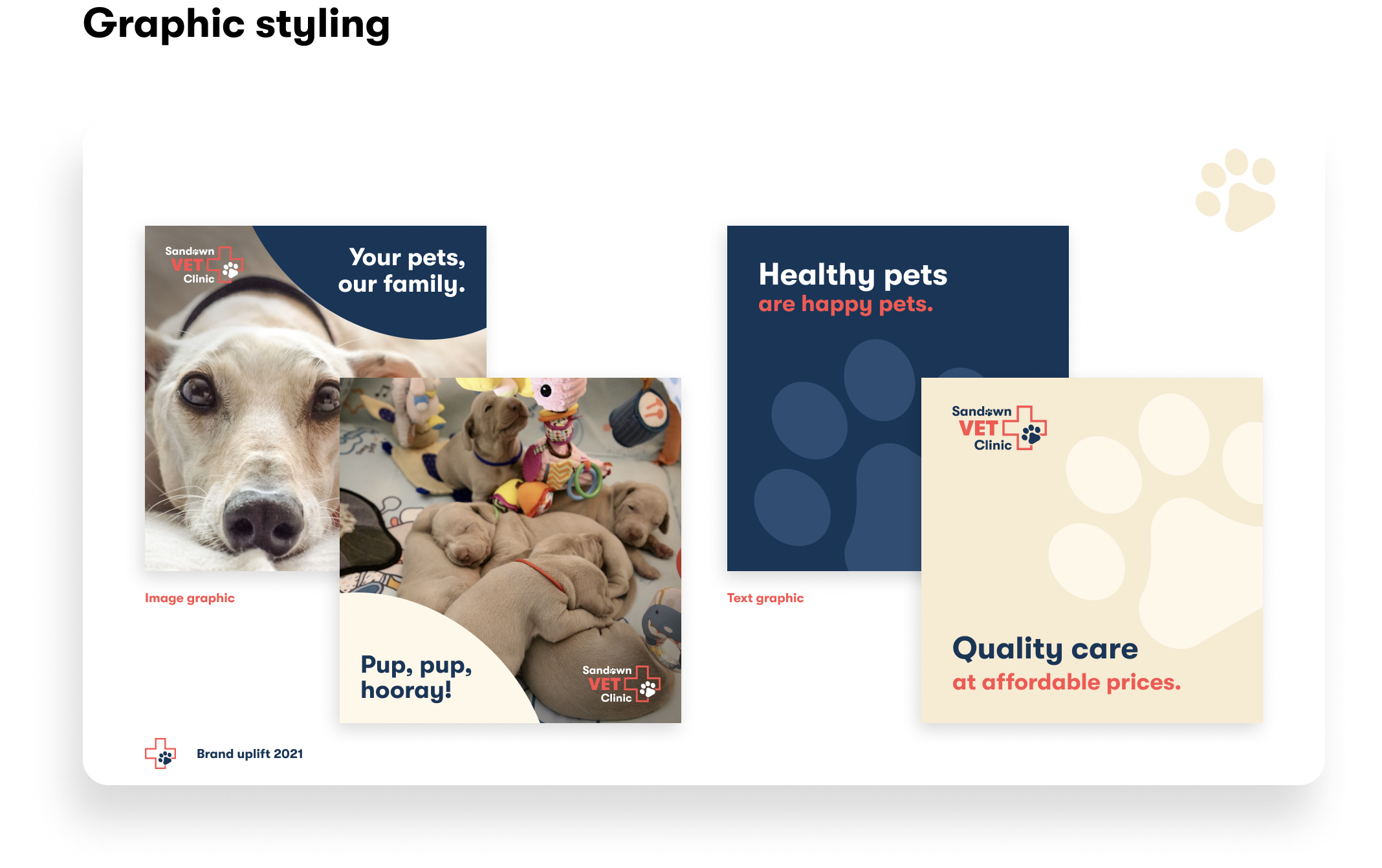
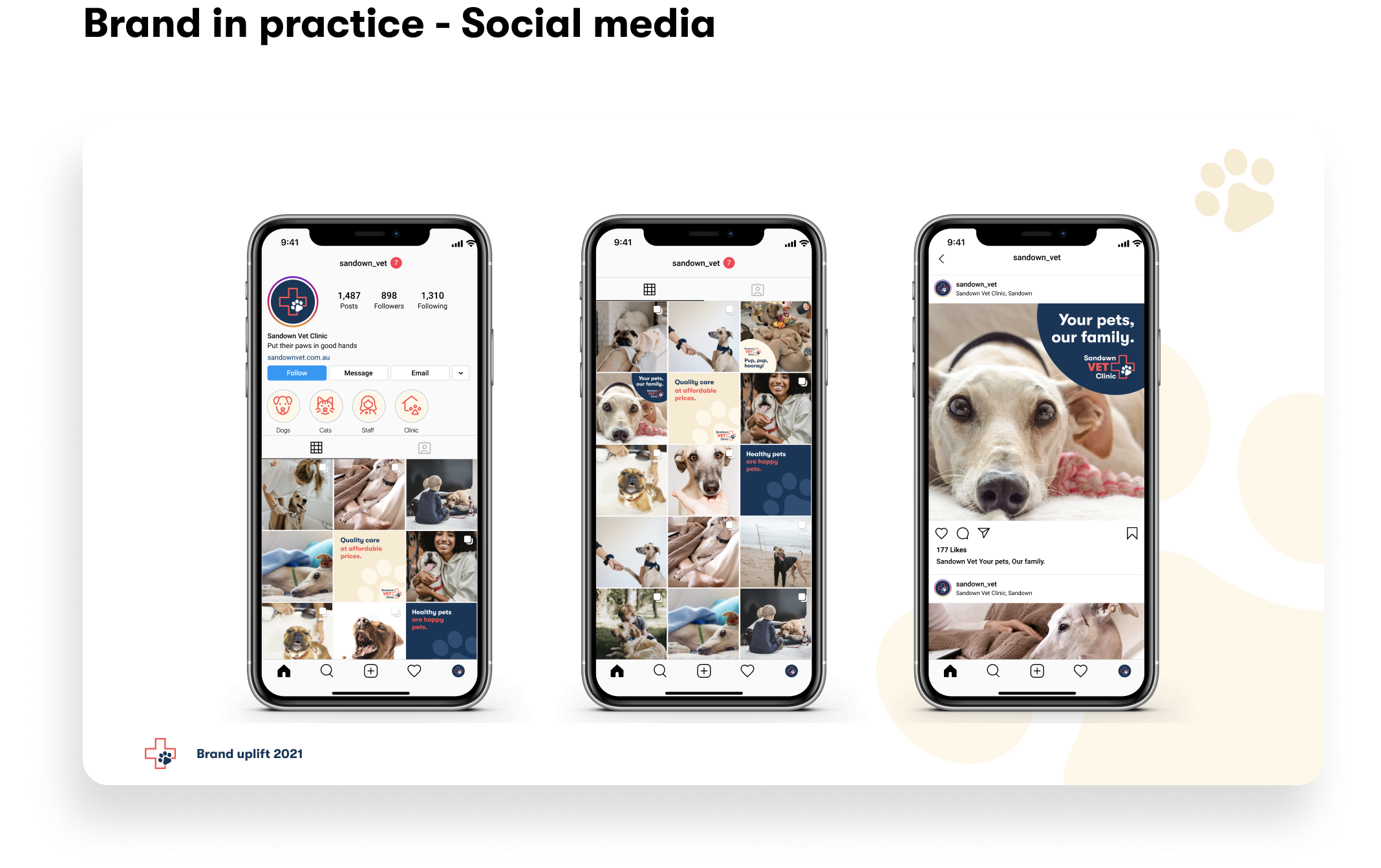
Brand application
I put together some examples of the brand applied to real-world scenarios, in order to show how the brand identity can exist across multiple mediums, while still feeling closely related to one another. The owners were so excited by what they saw that they immediately went into action to bring all of these ideas to life - quotes on new signage, painting of the clinic, uniforms, stationery and a new Instagram page!


Solution
Final product
My solution utilises various visual design principles, combined with the insights gathered throughout this process, to help solve the problems that customers had with contacting the clinic, finding resources and information, and building a more personal connection to the clinic.
The brand personality feels friendly, fun and professional, reflecting the values of the clinic.
