PERSONAL PROJECT
Crystal Wolf
Brand Identity and User Interface Design
Client Brief

Crystal Wolf Brewing Co. is whiskey producer based out of Melbourne, Australia. They have been producing high quality whiskey for over 80 years, using their unique production process of crystal filtration.
Goals
Crystal Wolf was looking to redefine their brand identity to both reflect the history and heritage of their brand, while also appealing to a younger demographic than their standard customer. The goal was to create a trendier brand that would resonate with the demographic of 20-30 years old males, with disposable income and a taste for smooth and flavoursome whiskey.
They wanted to appear classic, yet edgy, in a bold style that would fit into any trendy whiskey bar. The 4 ‘M’s were defined as key personality traits to be considered in the rebrand process:
Moody | Minimal | Mature | MasculineOrganization Goals:
Appeal to a younger demographic of 20-30 year old men and educate users on the unique filtration process and the product range
User Goals:
Learn more about the product range, how to use it, and where to find it.
Project Goals:
Build a unique visual identity that reflects the core brand values, and create a well structured, informative website.
Research
Market Research & Moodboards
Market research was key to understanding how competitors conveyed similar brand messages and values through visual identity and website design. It was observed that a large proportion of competitors were branded in a very traditional ‘gentlemanly’ style, with ornate lettering and similar colour palettes of browns and blacks. Although the plan was to differentiate Crystal Wolf from these competitors, it was still important to draw inspiration from these brands to ensure the final design would still fit within the whiskey market.
brand design
Identity Design
As a starting point for the identity design, I designed a logo that was simple, versatile and represented the key values of the brand. An icon was created using two thinly outlined triangles, symmetrically balanced - representative of a diamond/crystal, while also forming the shape of a wolfs head. The bold strike running through the horizon of the logo covers the placement of the wolfs eyes, resulting in a final design that was both edgy and bold.
The logotype was created using the typeface Tungsten Bold, a compressed sans serif font, which was selected because it’s modern and clean. Complimented by PT Mono, which is a monospace font with qualities of a typewriter. The two fonts work very well together to create an edgy, yet minimalist appearance, reminiscent of a stamp pressed down onto paper. These typefaces are used across all applications of the brand in various forms to create clear typographic hierarchy.
The brand colour palette was then created with tones of charcoal grey and ivory white being the primary colours. These colours provide both contrast to establish a strong modern brand, while also giving the brand a sense of age, with the faded blacks and off whites. Secondary colours of gold and red were implemented in order to provide a sense of class, energy and vibrance across brand application, and in photography/imagery.


website layout
Sketching
Low Fidelity Wireframe
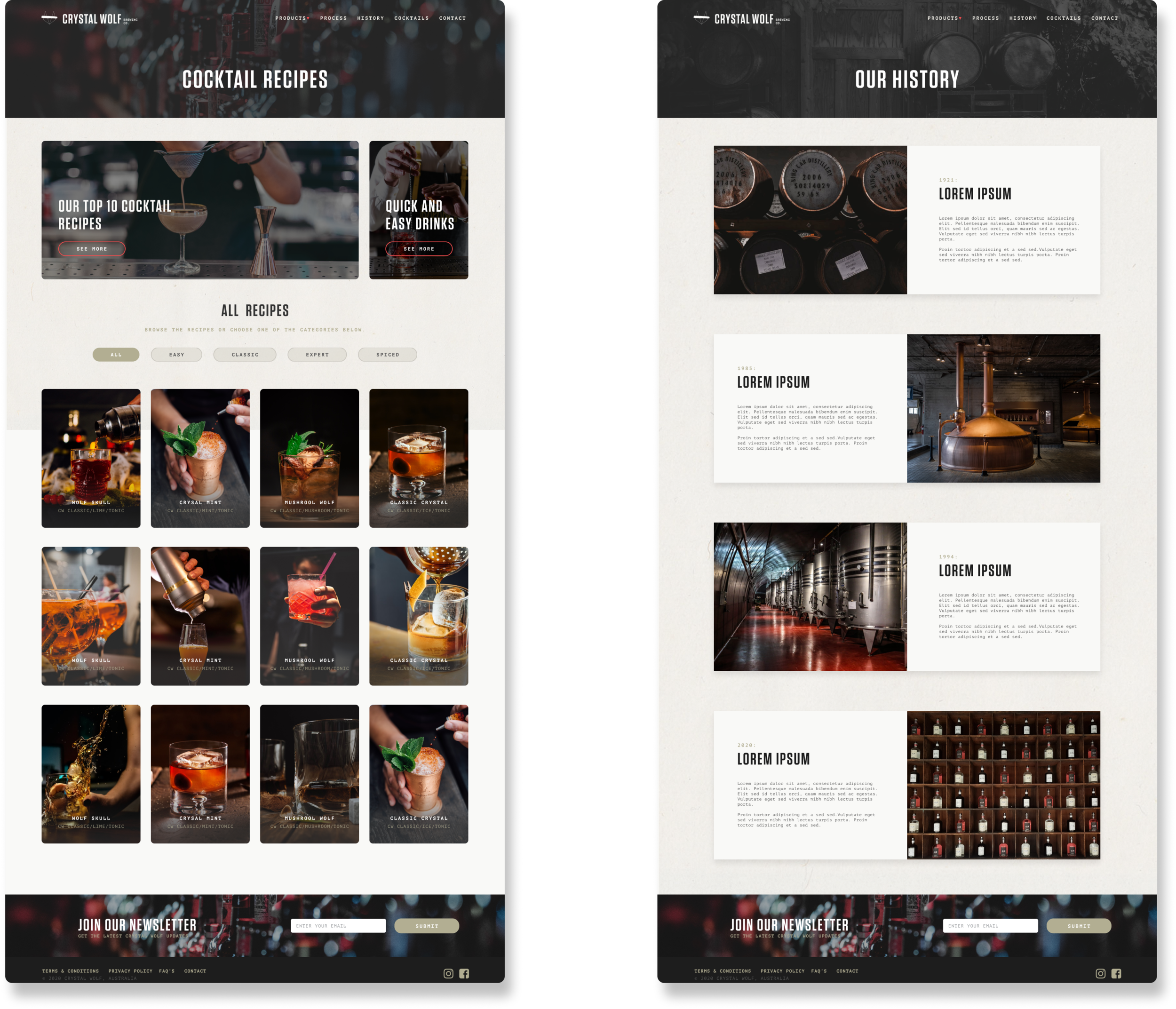
The sketching process allowed me to illustrate the primary objectives, and how users would interact with them. The first and most important goal was to educate users on the unique process of Crystal Wolf whiskey. This would be the primary call to action, featured at the top of the home page over the hero image. The secondary goal was to engage users by showing them various cocktail recipes. The third goal was to allow users to search for their nearest Crystal Wolf stockist, which would be featured in the footer of every page.
website Design
Design Pattern Library
Medium Fidelity Mockup
Solution
The Final Product
The final solution to this UI project is a well structured website design, that utilises layout, hierarchy, and bold imagery, to create a user experience that is both informative, and engaging. The site follows a 12 column grid system to ensure that the layout was well balanced, while maintaining consistent spacing across all sections and pages. This also allows easy translation to a mobile version of the website, following the graceful degradation method of responsive design. The website utilises contrast, colour and text size to conform to A standards of accessibility, based on the WCAG 2.0 guidelines, which is appropriate for this particular demographic.